


A website can look polished and still do the one thing a business website should never do: lose the lead. Most of the people who leave a site do not leave because the design is ugly. They leave because they cannot tell, quickly and without effort, whether the site is for them.

Website design mistakes: making the visitor do the work
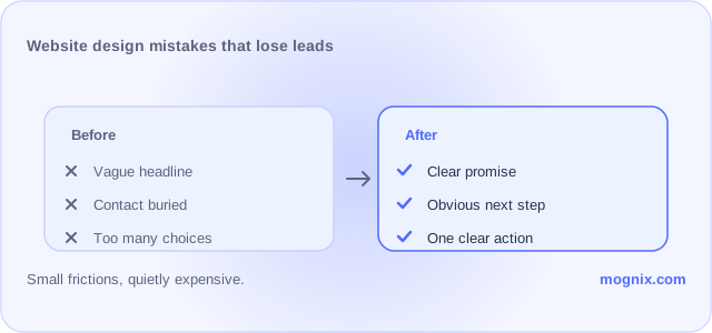
A strong homepage answers three questions almost immediately: what do you do, who is it for, and what should I do next. If a visitor has to read several paragraphs before finding any of those, the site has already made the job harder than it needs to be. People decide quickly. The site should make the decision easier, not more interesting.
The second mistake is too many choices
A page that offers a call, a WhatsApp message, a contact form, a newsletter sign-up, a live chat widget, and a quote request all at once looks generous. In practice, it often looks indecisive. The more options there are, the easier it is for someone to do nothing. One clear next step usually beats five half-options.
The third mistake is design that tells the wrong story
A beautiful site can still communicate the wrong thing. If it looks expensive but the business is trying to attract practical, budget-minded customers, the mismatch can work against you. If it looks stylish but does not look trustworthy, the style itself becomes a problem. Good website design is not just about appearance. It is about what the appearance says to the person you want to reach.
The fourth mistake is hiding the proof
Most people arriving at a service website are not ready to trust on sight. They need a reason to stay. Testimonials, case results, examples of work, short process explanations, real photos where that makes sense — these are the things that reduce doubt. Proof buried on a page nobody visits is not really proof at all.
The fifth mistake is forgetting mobile
A large share of visitors will arrive on a phone. If the site is hard to read, hard to tap, or slow to load on mobile, that experience is the experience. A site that performs well only on a laptop is not performing well where most people will see it. Speed, readability, and simple navigation on mobile are not details. They are part of the offer.
The mistake that matters most is the one nobody notices
The worst website mistakes are usually not dramatic. They are the small frictions that never get named: a vague headline, a missing phone number, a confusing form, a page that takes too long to say what it sells. Each one looks minor. Together they can quietly cost a business a steady stream of enquiries.
A website should do three things. It should explain the offer. It should earn enough trust to keep someone looking. And it should make the next step obvious enough that a reasonable person can take it without thinking too hard.
If your website is not doing that, see how Mognix approaches Web Design, read our guide to website design that converts, or request a free audit. Google’s PageSpeed Insights is a quick way to see how your site performs on mobile.