

A website can look polished and still fail at its only job: turning visitors into enquiries. After reviewing dozens of small business sites, the same five website design mistakes appear over and over.
1. Website design that fails in five seconds
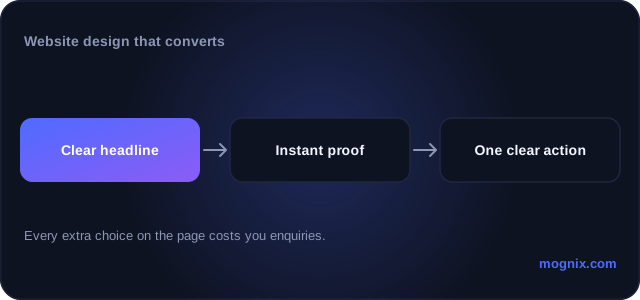
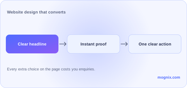
Visitors decide quickly whether this site is for them. The first screen should answer three questions: what you do, who it is for, and what to do next. Clever headlines that say “Empowering growth” answer none of them.
2. Too many next steps
Call, WhatsApp, form, quote, newsletter, chat widget: every competing action reduces the chance of any action. Pick one primary next step and make it repeatable, not negotiable.
3. Slow on mobile
Most of your visitors arrive on a phone, often on mobile data. Large unoptimised images, autoplay video and heavy page builders turn a three-second load into a lost customer. Speed is a design decision, not a hosting detail. Google’s PageSpeed Insights shows what your visitors are actually waiting for.
4. Design that impresses peers, not customers
Animations, parallax and unusual navigation earn praise from designers and confusion from buyers. The best-converting sites in most industries look almost boring, because nothing interrupts the path from question to enquiry.
5. No proof near the decision
Testimonials, case results, process steps and real photos reduce risk at exactly the moment of decision. Proof buried on a testimonials page that nobody visits does not count.
Your website should explain the offer, earn trust, and make the next step obvious. If yours is not doing that, see how Mognix approaches web design, or request a free audit and we will show you the three changes we would make first.
Trackbacks/Pingbacks